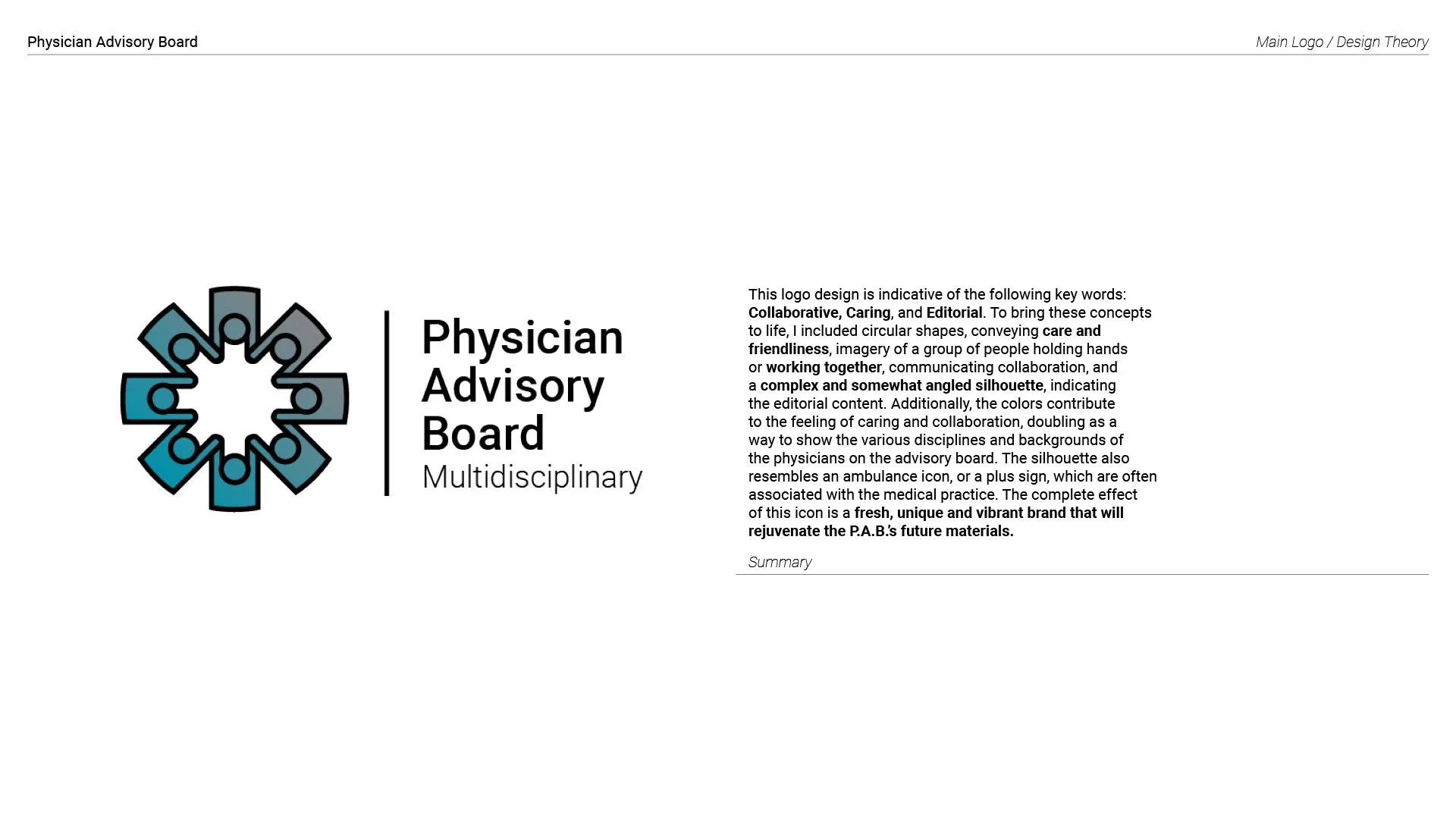
For this project I was tasked with created a sub-brand within PatientPoint for their Physician Advisory Board. The Physician Advisory board is there for PatientPoint to consult regarding specific editorial questions, clarify research, information or broader inquiries about how to improve the presentation of information within the medical field.
They wanted a bright, engaging look that could present their material in a more interesting light. To begin with, I designed a logo for them.
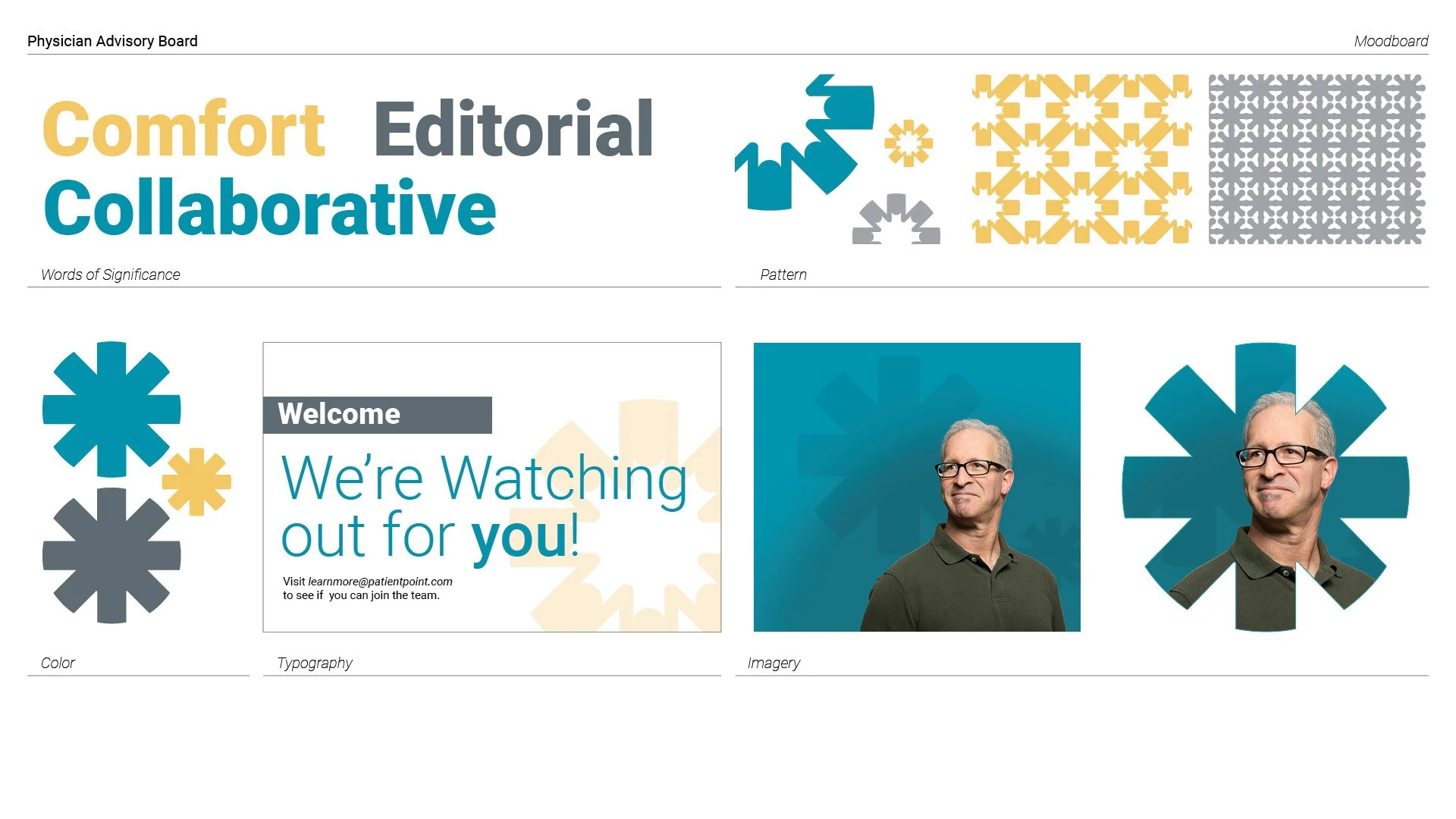
The final Visual Identity was built based on the mood of the logo. The slate and grey provided the necessary serious quality that physicians require, while the yellow highlight brings an element of joy and positivity that was much needed.
To round out my hand on the project, I created one solid print example of the identity in action by rebranding an existing board member flyer.
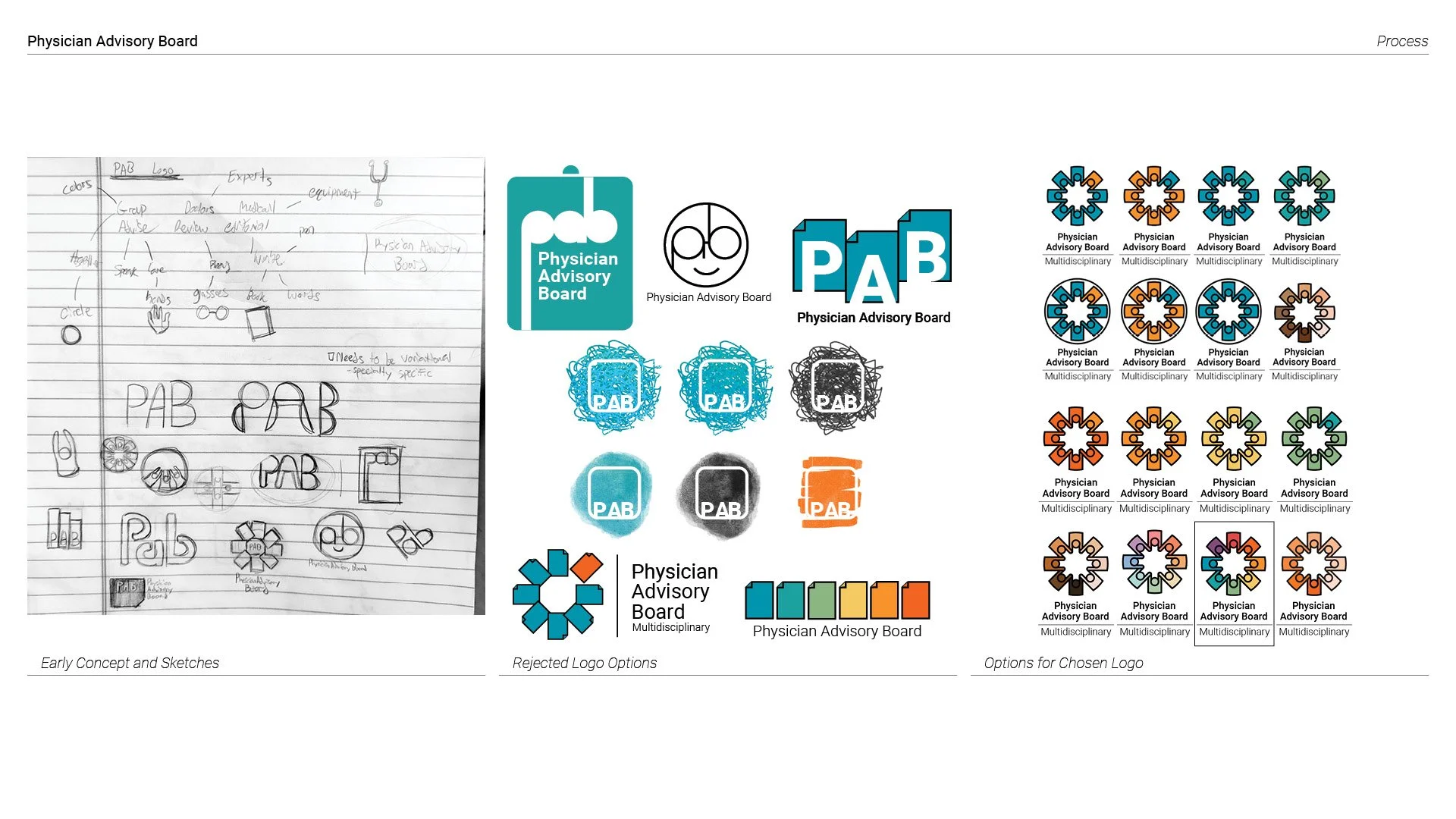
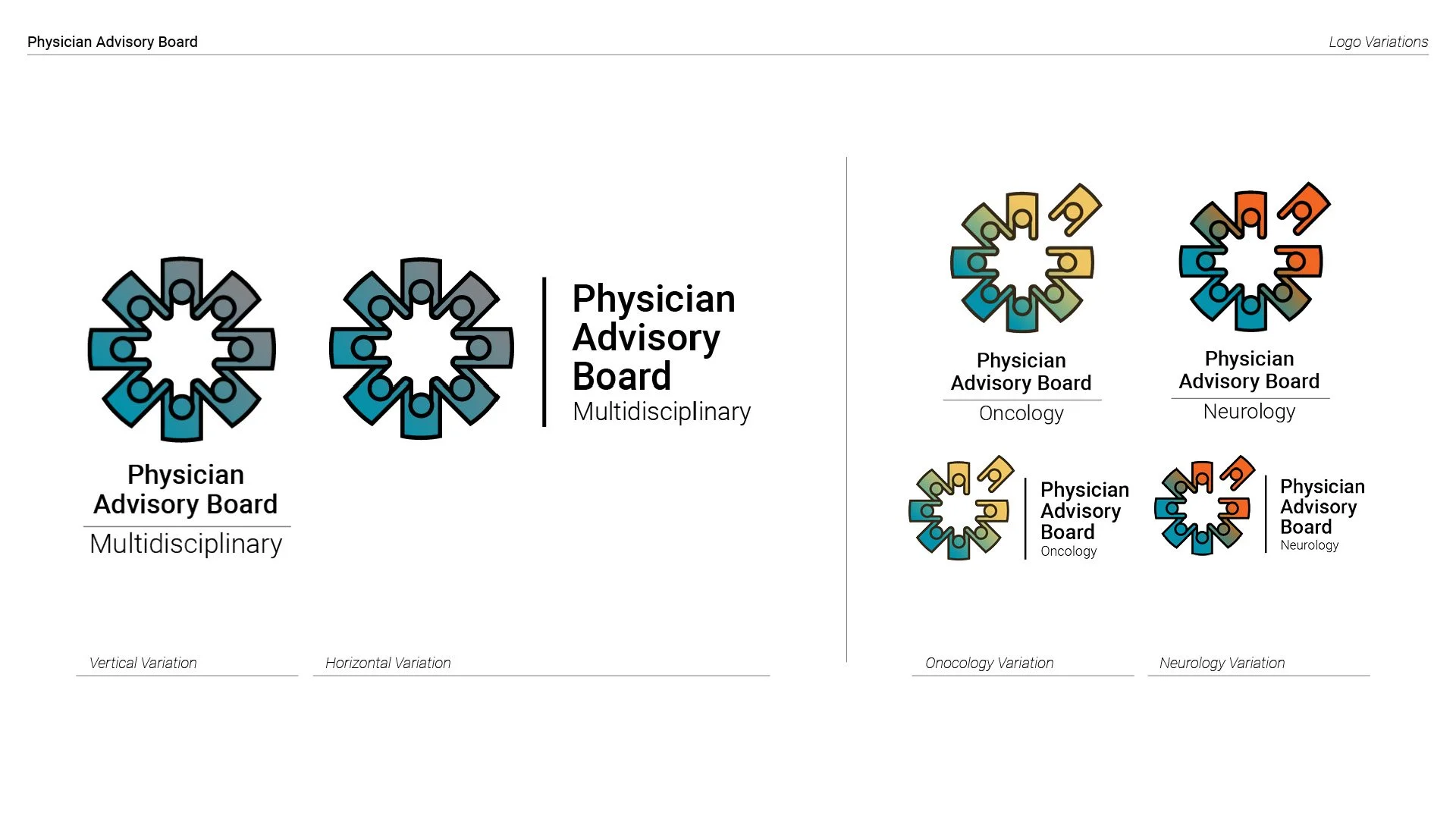
There were many Iterations, but the final design was chosen for its representation of the medical field through its similar iconography of the ambulance cross, its friendly round aspects paired with its more serious angular aspects, and its typographic lockups.


